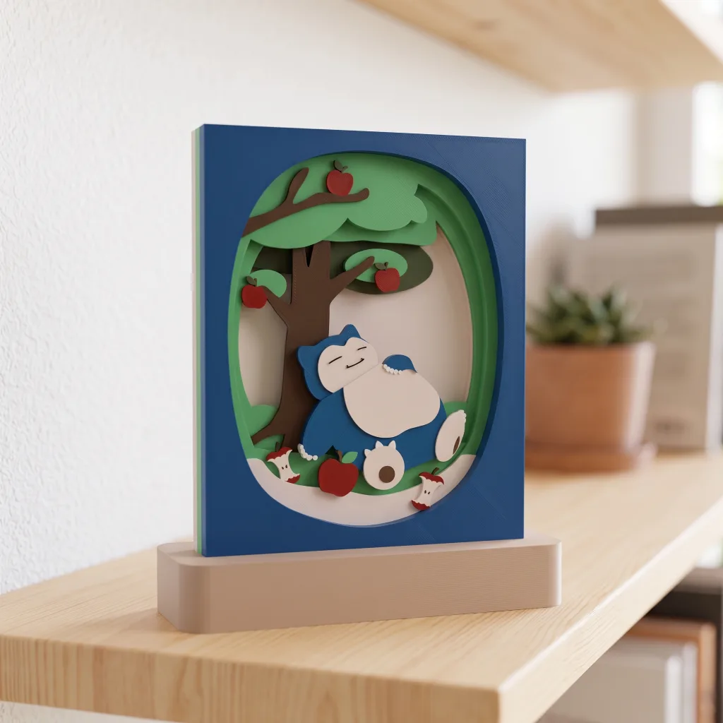
One character, one tree and a few apples. What kind of shadowbox could they become?
Look at my Snorlax piece. Its eyes are closed as it leans against an apple tree, with apples and cores nearby. The elements are ordinary on their own. Together, they bring to mind that moment after a good meal when you don’t feel like doing anything at all.
Stand Snorlax upright and arrange the tree and apples neatly around it, and the same ingredients feel different. Composition is where those positions, sizes and relationships are worked out.
The first article looked at the appeal of layered artwork. This time, let’s put the modeling software aside and turn an idea into a scene with depth. This step helps whichever tool you use to design a 3D printed shadowbox.
Start with the feeling of the scene
“I want to make a Snorlax” can go a little further. Is it sleeping, eating or blocking a path? The answer changes both its pose and its surroundings.
I prefer to describe the scene in one concrete sentence: “Snorlax has eaten its fill and is resting against an apple tree.” That gives me things I can draw: a relaxed body, closed eyes, a trunk to lean on and cores left on the ground. It also gives me a reason to choose that background.
Sharp branches and a frame full of slanting lines might make a resting scene feel less settled. A broad canopy, a rounded opening and a little space beside the body suit this theme better. The frame’s outline belongs in this decision too. It determines how the scene is enclosed and how much of it we can see.
You don’t need a long backstory to begin. Write a sentence that suggests a pose and a setting, then keep it beside the sketch. Each new element can be checked against it.
Decide where the eye should go first
The brightest area, largest shape or strongest color contrast can all draw attention. Even if the character is centered, its surroundings still matter.

In Umbreon’s night scene, the yellow borders are easy to notice. Follow the contours inward and Umbreon’s ears, red eyes and yellow rings appear in the middle. The crescent on the frame establishes nighttime, while the dark area around the character leaves room for its silhouette.
Make the stars larger, or push a bright background shape up against the face, and the eye may bounce between several places. Decorations that look good individually don’t always work together.
For a first sketch, I’d put in the character and just one or two major background shapes. Shrink the image and see whether the subject is still easy to find. Then add the moon, fruit or plants, checking as you go. There’s no hurry to fill every gap.
Try two arrangements of the same idea
Here are two composition sketches for Snorlax’s orchard. They compare arrangements; the shapes stand for the positions of the character, foliage and fruit.
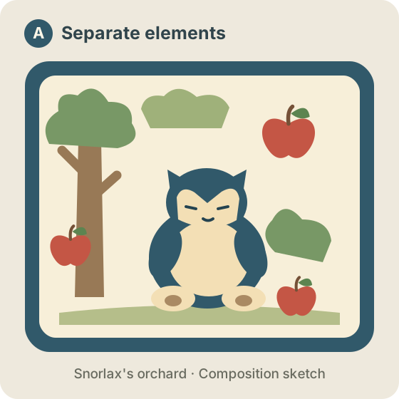
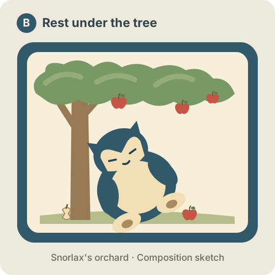
For a scene about “a nap under an apple tree,” I’d choose B. The character has something to lean on, and the canopy seems to shelter it. Space beside the face makes the closed-eye expression easier to read. A few apples already establish the orchard; every corner doesn’t need decoration.
A feels more like collecting several favorite motifs inside a frame. That can work if a group of distinct images is the point. I choose B here because I want the relationship between tree and character to be visible.
Look back at the finished Snorlax piece and you’ll find a similar arrangement: the trunk on one side, the body extending toward the other, foliage across the top, and apples and cores drawing attention down. The composition should return to that sentence about what the piece is meant to express.
At this stage, moving shapes and changing their sizes is enough. The two sketches don’t need polished drawing. They just need to show which arrangement is closer to your idea.
Make the foreground, middle ground and background readable
Once the broad composition works, think about overlap. Much of a layered shadowbox’s depth appears where edges meet: one leaf covers another, the character hides part of a trunk, and a contour near the frame covers some background.
I’d first sort the scene into three broad groups: the foreground, the character’s middle ground and the distant background. Check how they meet before deciding the exact number of layers.
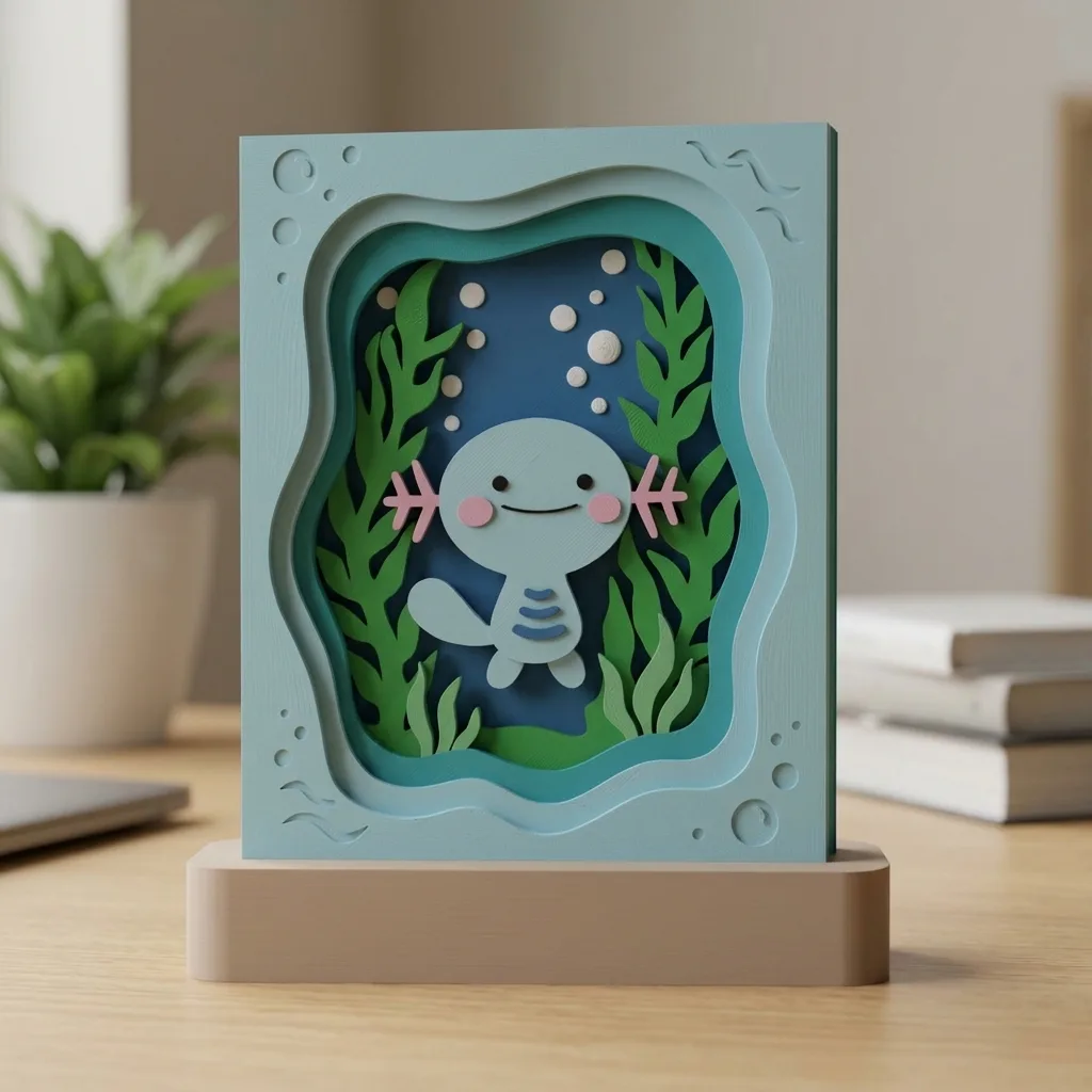
In Wooper’s underwater scene, the dark blue background sits behind Wooper, while plants and the frame surround the opening. The plants vary in height and fill much of the scene, but the face and pink gills remain clear.
A wide plant crossing the face would interrupt the character. Instead, try letting the foreground cover a small part of the body’s edge or lower area, leaving the head and distinctive features visible. You get overlap while keeping the character readable.
Two contours that only just touch can also look awkward. A plant tip meeting an ear tip may seem to form one continuous shape. I’d move them slightly apart or give one a definite overlap. That usually makes the depth clearer.
What needs a separate layer?
An element in the sketch doesn’t automatically need its own layer. First ask what it does in the scene.
If the trunk needs to sit behind the character and fallen fruit needs to sit in front, there’s a reason to give them separate depths. Two groups of plants that overlap at different distances may need separating too.
Leaves at the same distance, or stars scattered across one background, can initially share a visual layer. They can have individual outlines and different colors without each needing another step in depth.
“Belonging to one visual layer” and “printing as one connected part” are separate decisions. Color, connections and whether a part can be handled and assembled all need checking during modeling and test printing. Clear depth relationships make those later decisions easier.
Before adding a layer, ask what it should hide, reveal or give a clearer sense of depth. If it has no specific job yet, try it in the sketch first. Looking at the scene again with that layer removed is a useful comparison.
Keep the features that make the character recognizable
Once a scene fits inside a small frame, not every detail stays equally clear. 3D printing also brings limits around thickness, strength and connections.

Look at Gengar: pointed ears, spikes around the body, red eyes and a large white grin are easy to recognize. Even without the moon and little ghosts, the character already has an expression.
I’d keep those outlines and expressions first, then consider decoration. Wooper’s gills and Umbreon’s ears and yellow rings deserve similar space. If the character becomes hard to recognize, extra scenery rarely fixes the piece.
For the background, start with a few main outlines: a trunk and canopy for an orchard, tall plants for an underwater scene or a crescent for a night sky. Closing tiny gaps between leaves or reducing fine branches can sometimes make the setting easier to read. Keep shrinking the preview as you decide which details to retain.
Before printing, check those contours in the slicer too. A thin branch may look fine on screen; whether it forms properly, holds together and has somewhere to connect depends on print settings and test prints.
Finish a small sketch before opening the modeling software
For a first shadowbox design, try this: choose a character, write one sentence about where it is and what it’s doing, then draw two sketches with different arrangements.
Begin each sketch with only the character, one major background shape and a frame. Choose the one closer to the theme, mark the foreground, middle ground and background, and add a few decorations last. That makes it easier to tell whether you’re changing the composition or simply adding another object.
I’d check four things:
- Is the subject easy to find when the image is small?
- Do the setting and pose suggest the same scene?
- Are overlaps clear, without contours just touching?
- Does each layer have a reason to occupy its depth?
The sketch doesn’t need to be beautiful yet. It should tell you where the subject is, what’s around it, what overlaps what and which features must stay. You can then open the modeling software with an image to refer back to.
Continue with 03 · Choosing Shadowbox Design Software to compare the tools for turning these outlines into parts with thickness that can be assembled. Meanwhile, browse the Shadowbox Pokémon collection and pick a piece you like. Sketch it with just a few broad shapes. Many of its composition choices become easier to see that way.